Authentic and approachable. Upbeat and optimistic. Helpful and respectful. Straightforward, but not stiff. Not afraid to throw in a little humor, but not cheesy, cheeky or sarcastic. Confident in our facts, not preachy. Conversational without being casual. Action and results oriented.
Speak as a trusted colleague, directly in their language, and with insight into their issues and where they are coming from. Approachable and personal. Use first person as the default: "...your grocery store will benefit..." vs. "...grocery stores will benefit..." Be simple, upbeat and clear.
Elegance is the intersection of simplicity, sophistication and usefulness. Our designs, products and communications are clean, simple, and uncluttered, delivering value in a delightfully efficient way. The outcome epitomizes 'less is more' and minimalist refinement.
We are on the frontier, pushing the boundaries of creative innovation. We inspire our clients to follow suit, empowered with solutions that give them a competitive edge and establish them as industry leaders.
We cut our teeth on carefully listening to customers and then going to the wall for them. That grass-roots, scrappy spirit still drives everything we do.
We craft sophisticated products that are easy to use by taking the most demanding technical challenges and making them simple and painless for the user.
In essence, it's complexity simplified.
Clear space is essential both on the web and on printed materials. The clear-space guidelines should be maintained as the logo is proportionately scaled.
The letter mark can be cropped slightly to add interest for specific applications such as promotional items but should retain its recognition.
The letter mark should complement the primary logo and follow the same clear space rules as the primary logo.


Layout & Designs should use the primary colors.
ShopHero Black should be the primary color of typography (ShopHero White if the background is dark).
#1179BB
#BB112D
#1179BB
#FFFFFF
Secondary colors help to supplement the primary colors.
However, designers should never use them as the primary focus of the design.
#1594E3
#0D649B
#E31537
#A7112A
Designers can use complementary colors with our primary colors, but they should be limited.
#B6E3CC
#A7112A
#C9F42D
#713D63
#FFF24B
#F28500
#F6F6F6
#DEBD88
#C2AFF0
#2A1F2D
We use Satoshi as our main font, giving different weights to Headings, sub-headings and copy to highlight typography hierarchy.
Lorem ipsum dolor sit amet, consectetur adipiscing elit. Suspendisse varius enim in eros elementum tristique. Duis cursus, mi quis viverra ornare, eros dolor interdum nulla, ut commodo diam libero vitae erat. Aenean faucibus nibh et justo cursus id rutrum lorem imperdiet. Nunc ut sem vitae risus tristique posuere.
Lorem ipsum dolor sit amet, consectetur adipiscing elit. Suspendisse varius enim in eros elementum tristique. Duis cursus, mi quis viverra ornare, eros dolor interdum nulla, ut commodo diam libero vitae erat. Aenean faucibus nibh et justo cursus id rutrum lorem imperdiet. Nunc ut sem vitae risus tristique posuere.
Use Inter as a substitute for Satoshi when it isn’t available.
Lorem ipsum dolor sit amet, consectetur adipiscing elit. Suspendisse varius enim in eros elementum tristique. Duis cursus, mi quis viverra ornare, eros dolor interdum nulla, ut commodo diam libero vitae erat. Aenean faucibus nibh et justo cursus id rutrum lorem imperdiet. Nunc ut sem vitae risus tristique posuere.
Lorem ipsum dolor sit amet, consectetur adipiscing elit. Suspendisse varius enim in eros elementum tristique. Duis cursus, mi quis viverra ornare, eros dolor interdum nulla, ut commodo diam libero vitae erat. Aenean faucibus nibh et justo cursus id rutrum lorem imperdiet. Nunc ut sem vitae risus tristique posuere.
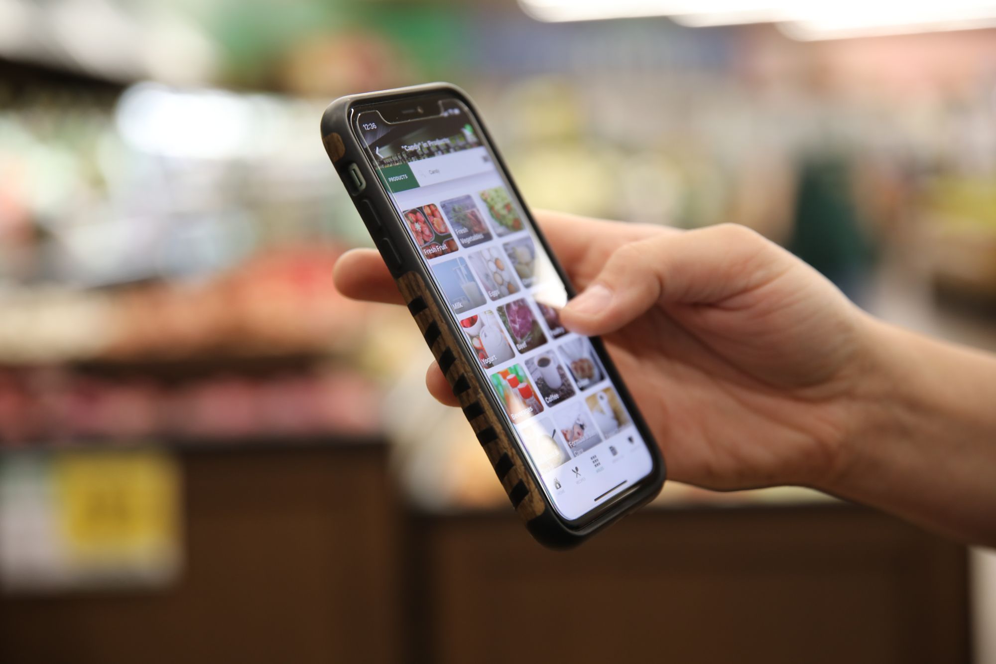
Click or tap any image to reveal full size images.